Interaction Design
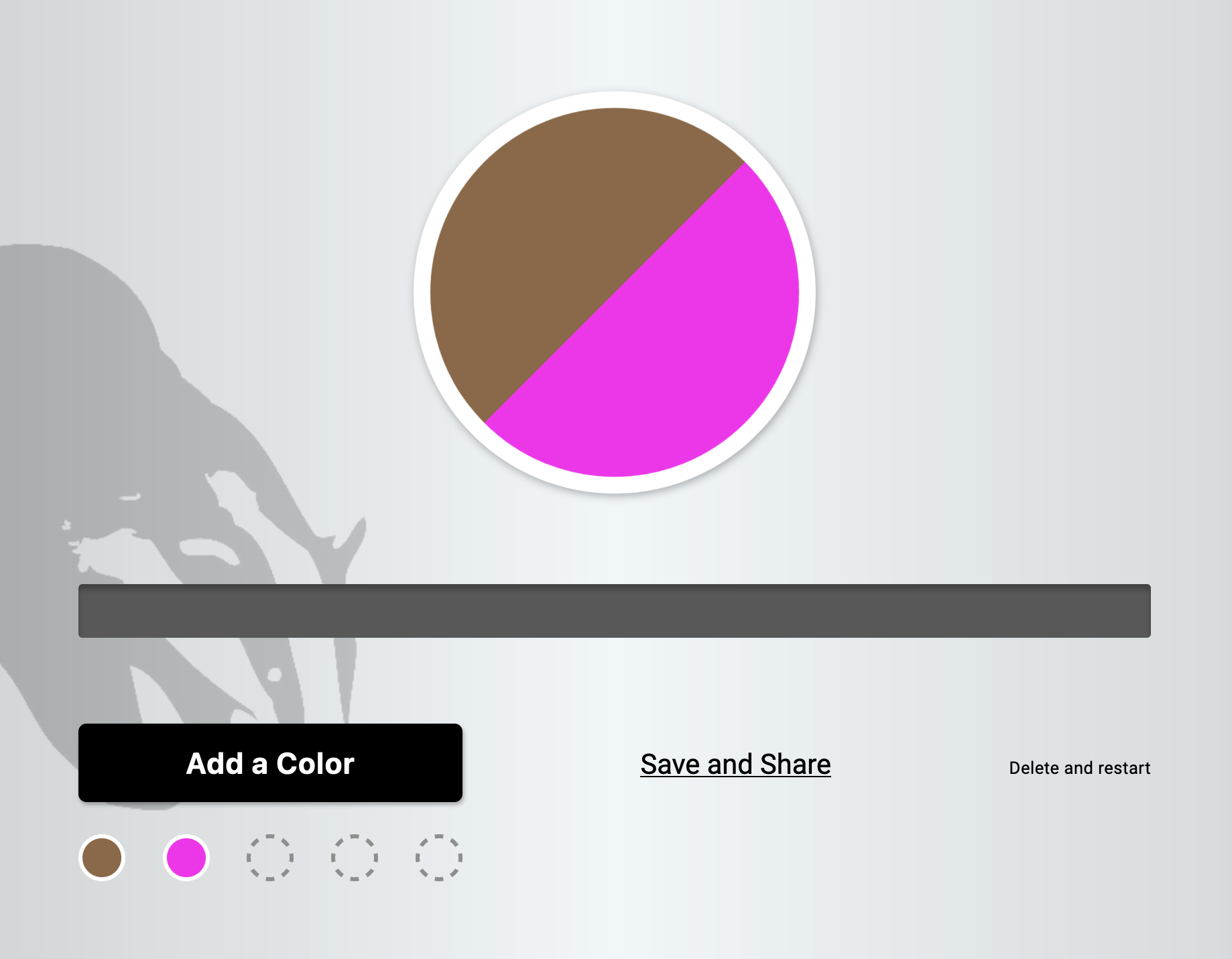
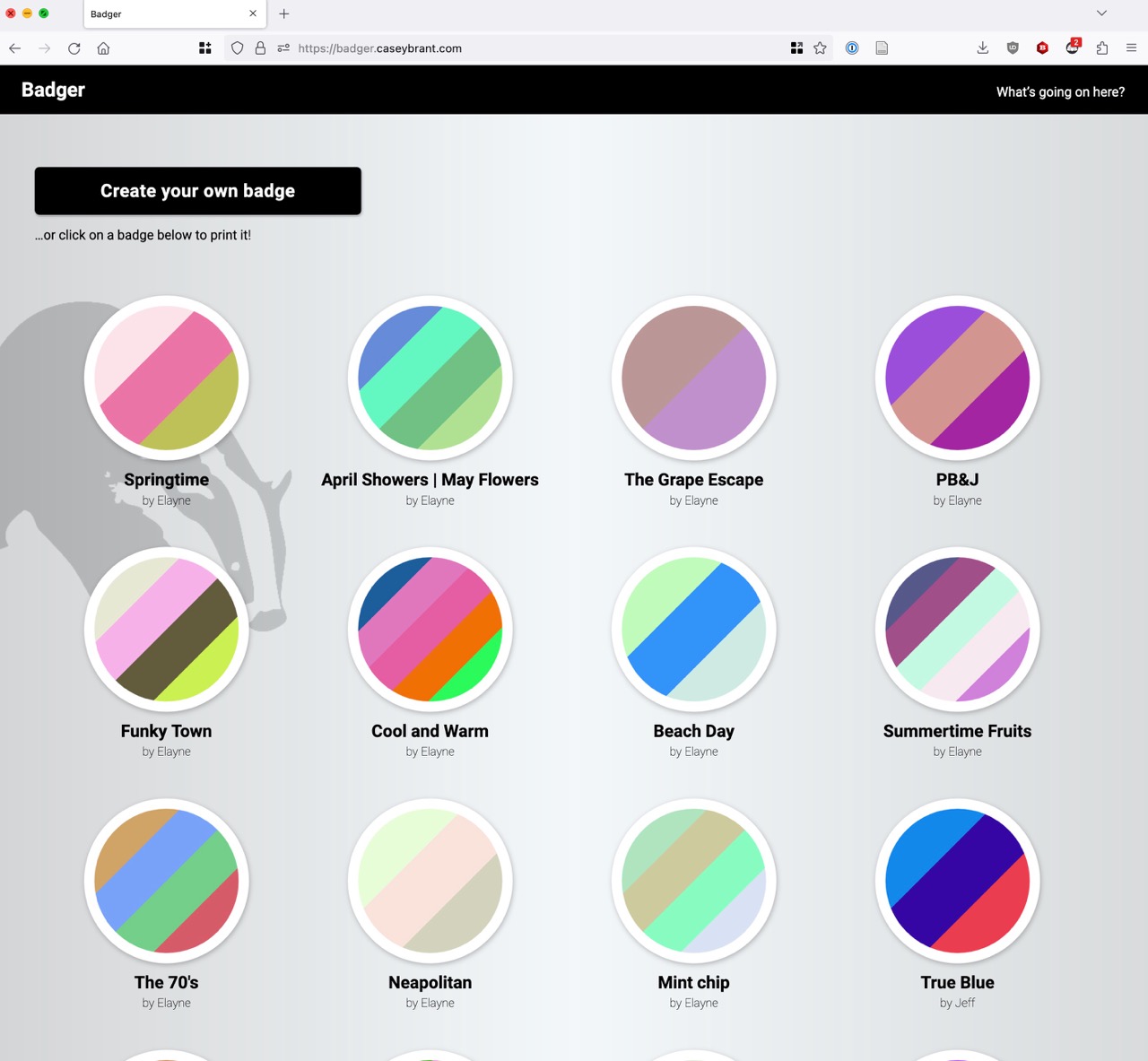
This is a small web app I built called Badger. It’s up and running, so please check it out! This project was an exercise in interaction design at the finest level of detail, and it taught me a lot about designing with subtle (and some not-so-subtle) animation to direct attention and enhance user experience from moment to moment. It was also fun to follow the design phase with some programming!
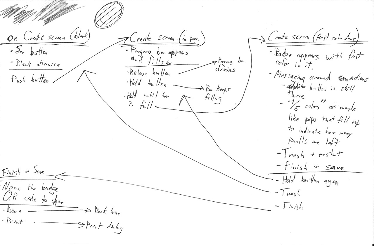
My starting point was “app that generates colorful badges, with gamification elements.” From that simple idea, I started with some ideation about user flows.
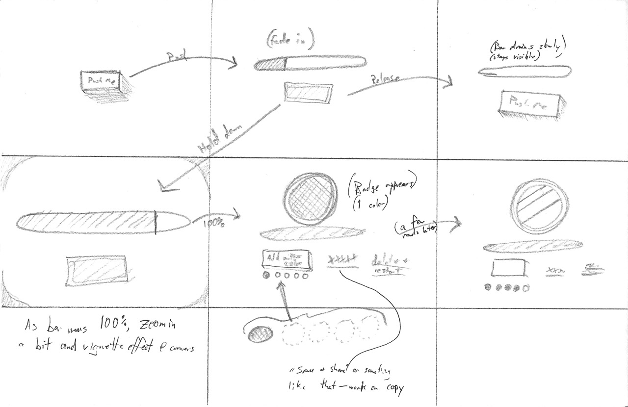
After getting a rough idea of the flows, I moved into sketching possibilities for how these interactions might look.
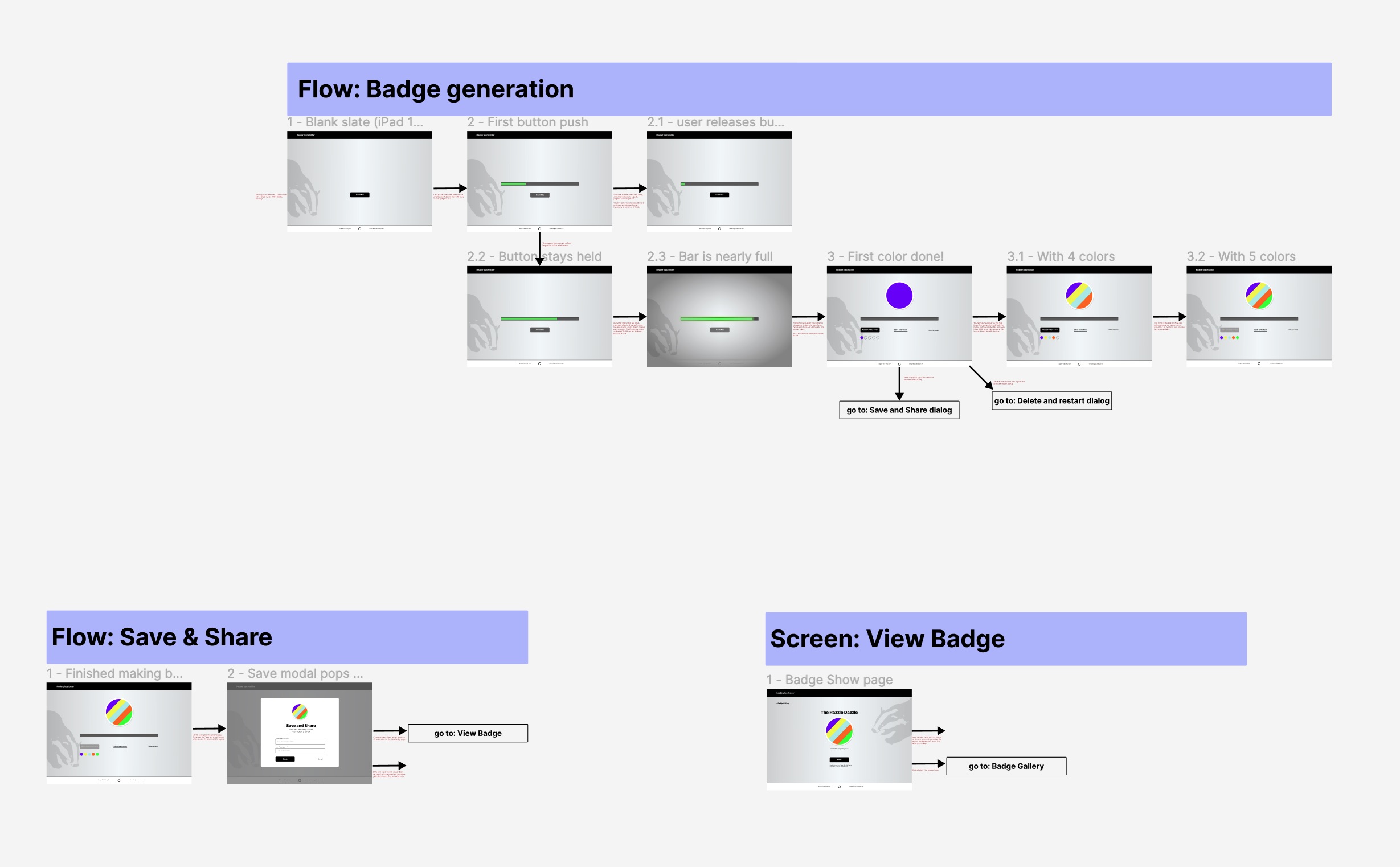
I decided to get some practice with Figma for making higher-fidelity mockups of the screens and the transitions between various app states based on user actions. This was my first time using Figma for a real project! There was a bit of a learning curve, but I managed.
After getting the basic idea down in Figma, I went right into code. I used the Ruby on Rails framework for the back end, but since the bulk of this project is about interactions, I spent most of my time writing JavaScript and SCSS.
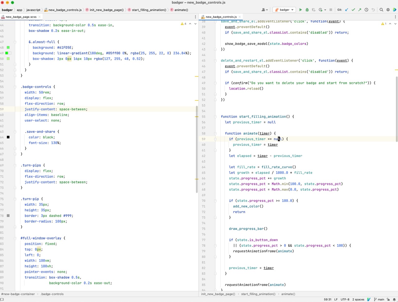
This screenshot is part of the code responsible for animating the progress bar when creating a new badge. The full codebase is available on Github.
Ultimately, it’s hard to get a sense of animated interactions from static screenshots and text. I hope you’ll check out the live app!