Package Design
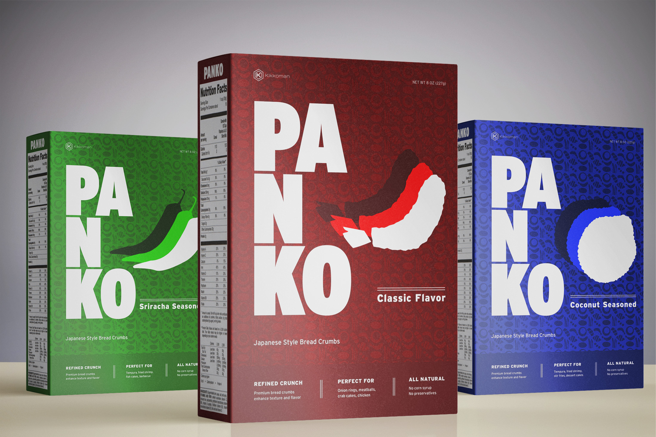
A redesign of the classic bread crumb packaging. My goal with this project was to class things up while retaining that fun energy of the original. Think more “high-end New York tempura” rather than “mozzarella sticks at the local family restaurant.”
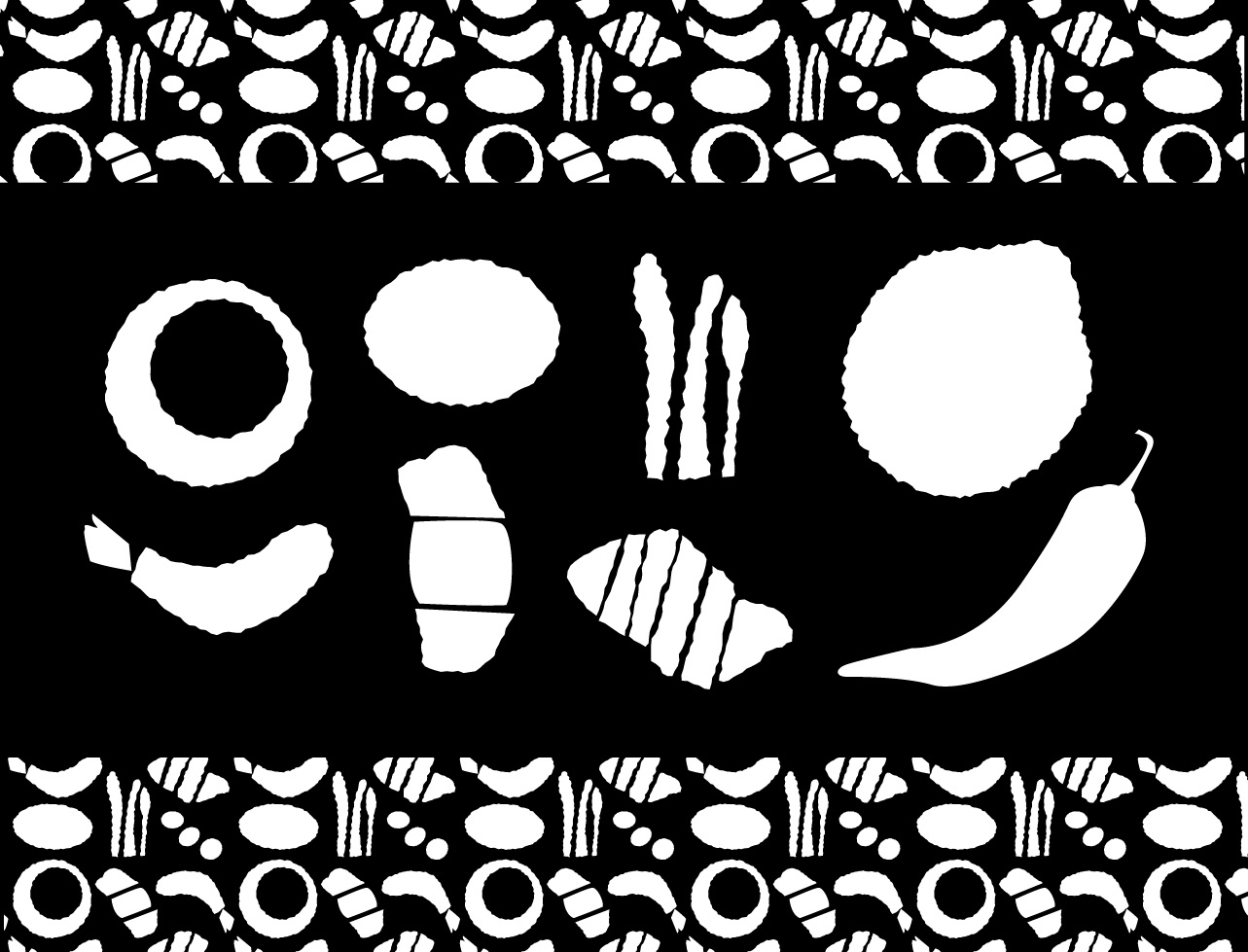
In Illustrator, I created simple illustrations of some foods most often associated with Panko bread crumbs, with an eye towards using them both as standalone images and also fit together in a pattern for the box backgrounds.
I extended the same goal to the Kikkoman logo, aiming for simplicity without abandoning the energy of the original. The current Kikkoman typeface was a bit too close to the Interstate Condensed I'm using for the main box, so I picked something with more contrast.
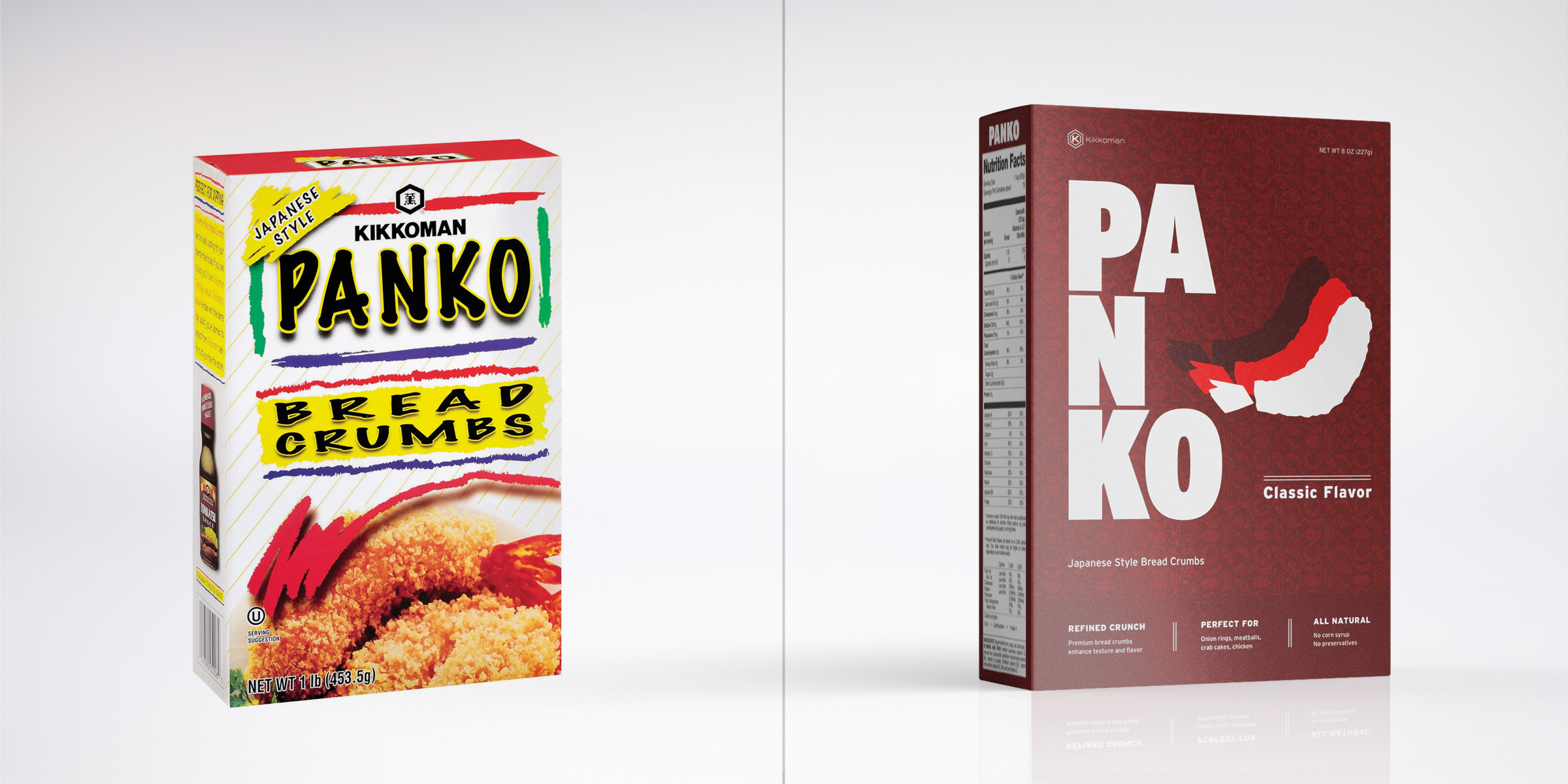
Existing Panko branding next to my redesign