Pencil Ad Series
A series of two magazine ads for the (excellent) Tombow Mono brand of pencil. For these ads, I wanted to take inspiration from those classic 1970s magazine spots with long-form copy and simple product photography. My major learning from this project was that when you choose to have a small number of elements on a page, the care with which you treat each of the individual elements goes way up.
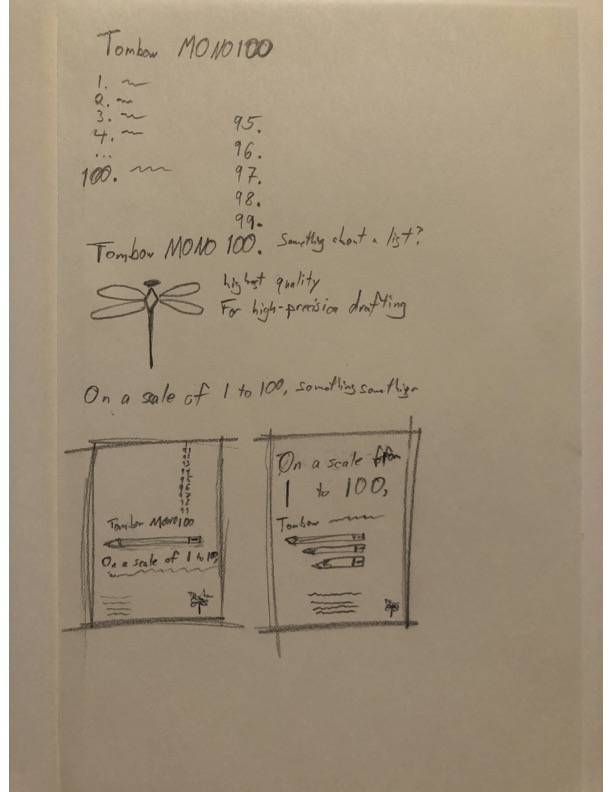
I started with several sketches (in pencil, of course).
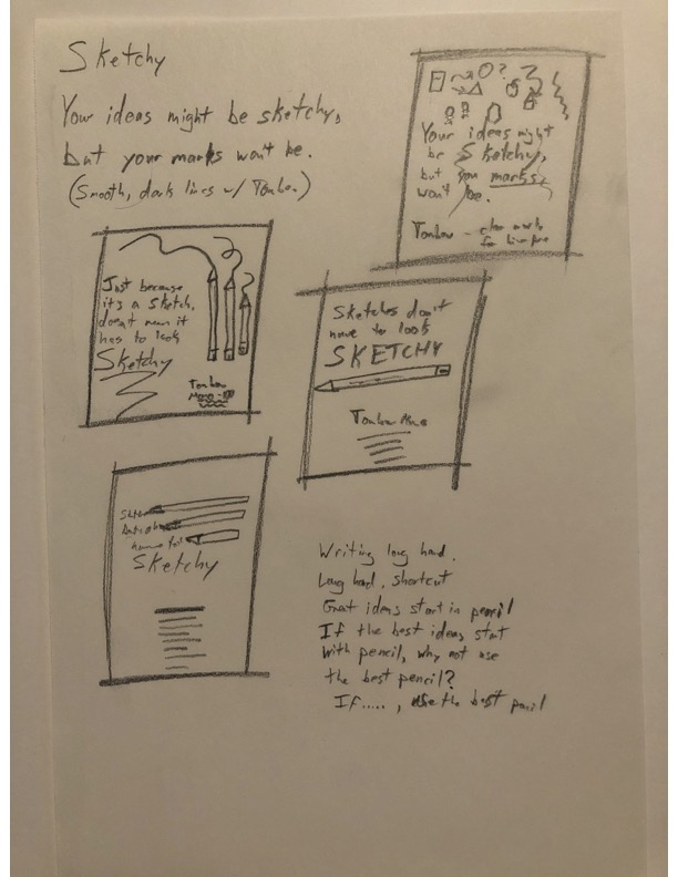
Playing with adding and removing elements.
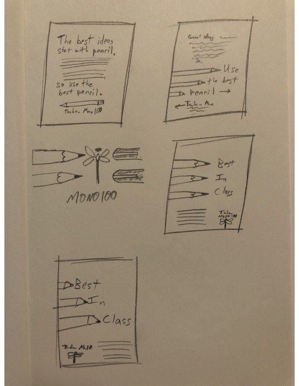
As I worked through ideas, the page got simpler and simpler.
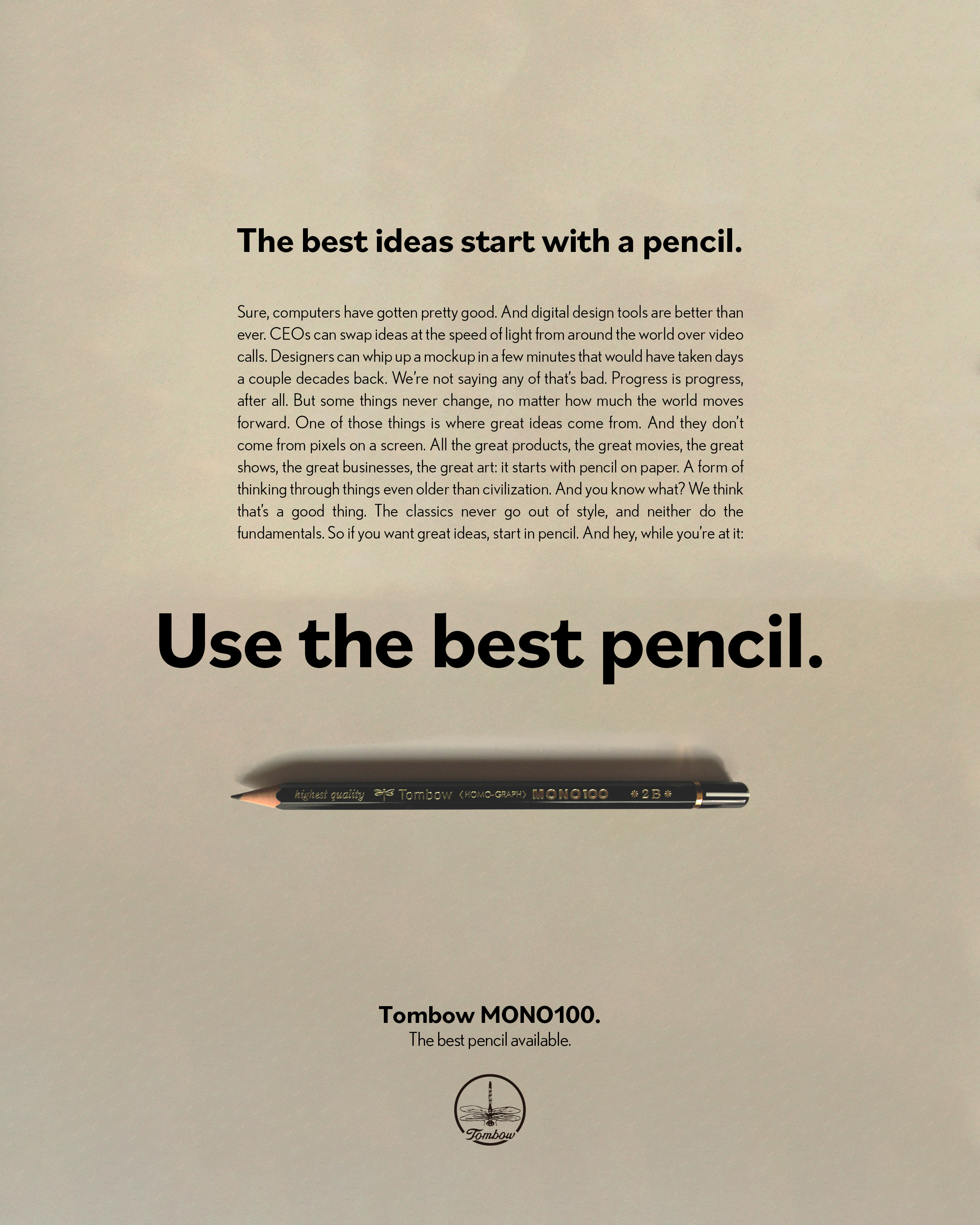
First draft. The concept is there in rough, but things are sloppy and they aren’t cohering as a series yet. With so few things on the page, I needed them all to be treated much more thoughtfully.
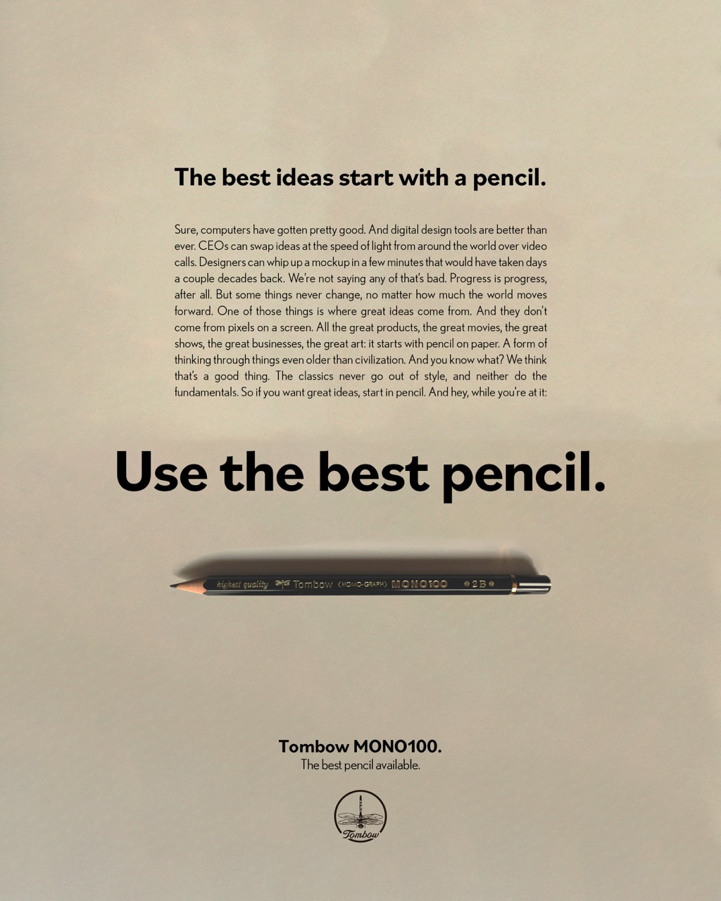
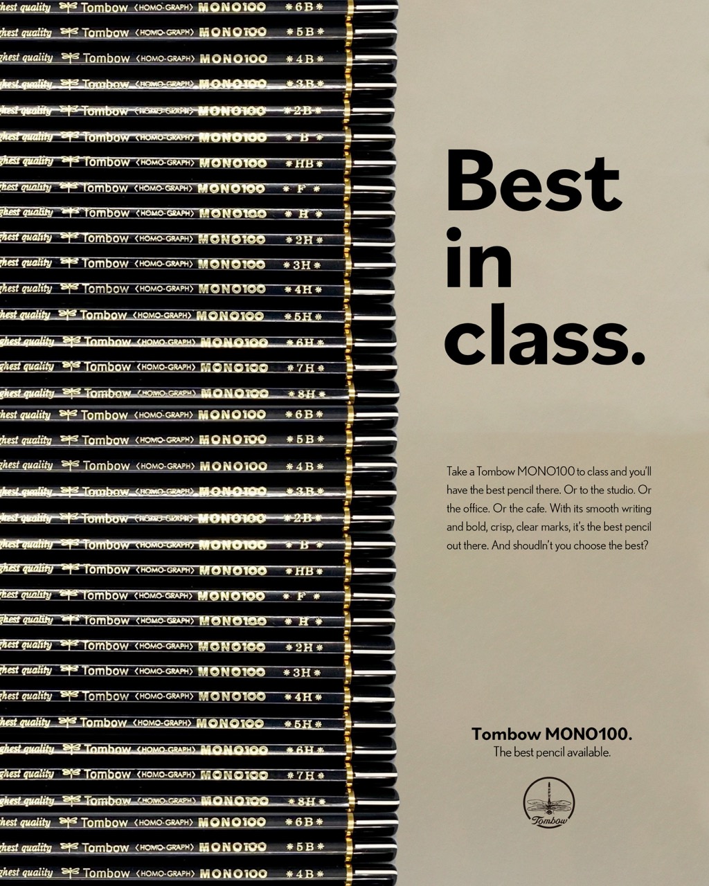
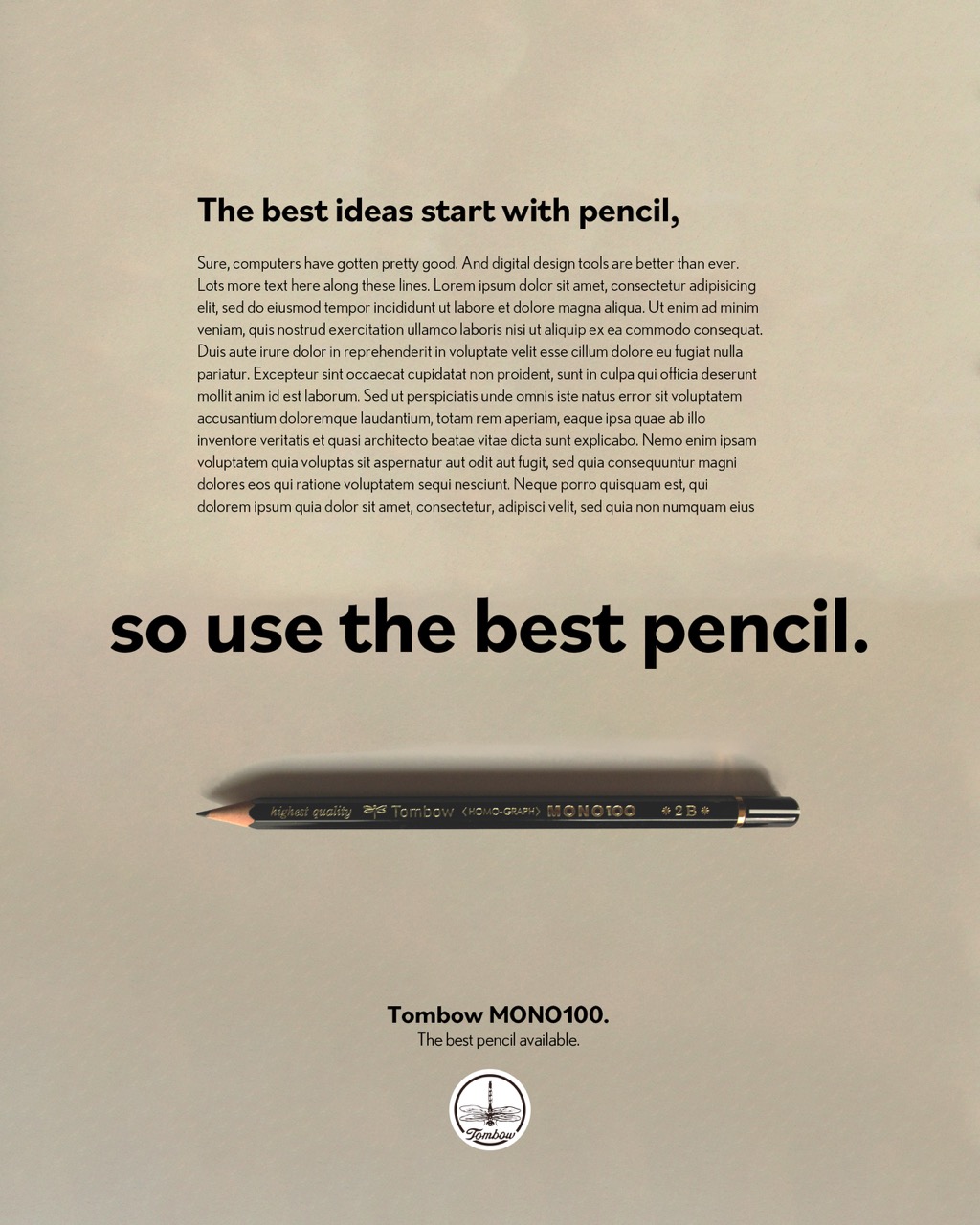
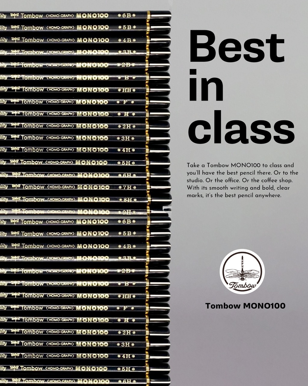
The finished product. Everything is aligned, the logo is treated better, the copy is edited down and squared up. Now it’s a series.