Catalog Layout
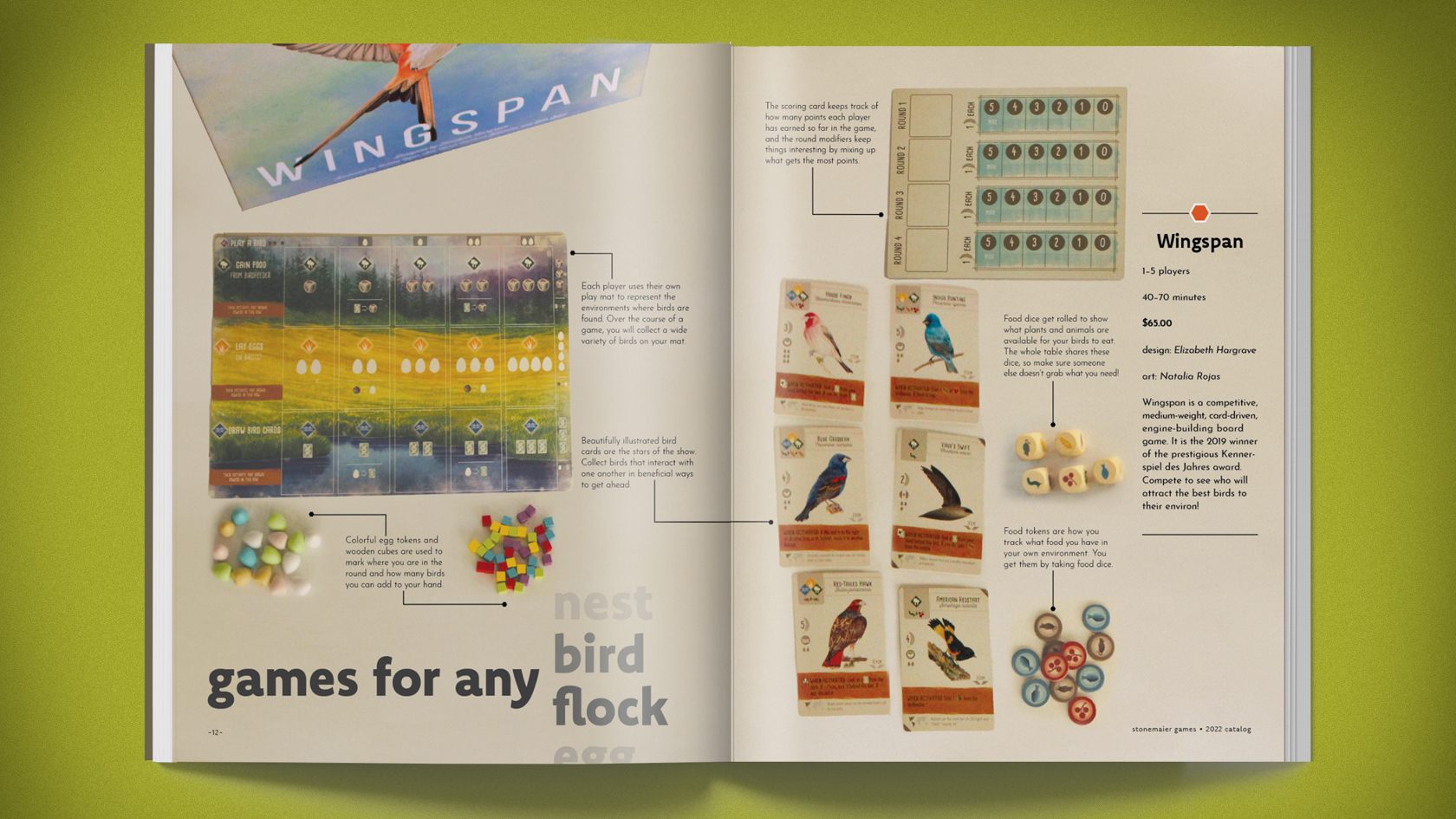
Here’s one spread from a brand catalog I did for Stonemaier Games. In this project, I learned that type can get really small in print. I’m used to designing on and for screens, so seeing just how low I could go and still have things be clean and readable was a big learning moment.
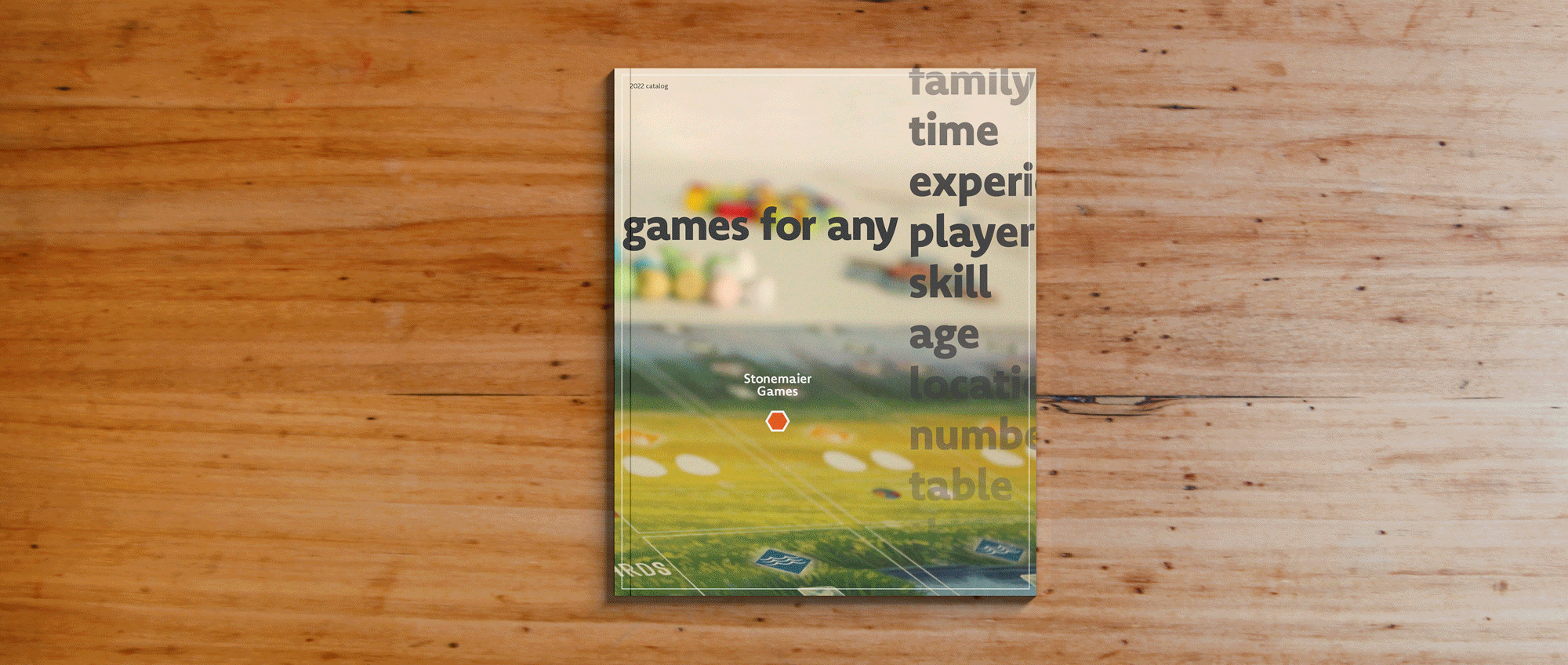
The concept for this catalog is “Games for any player,” emphasizing the brand’s mission to create and publish games for an inclusive audience. I started developing this concept by researching the company and brainstorming ideas that fit how they talked about themselves.
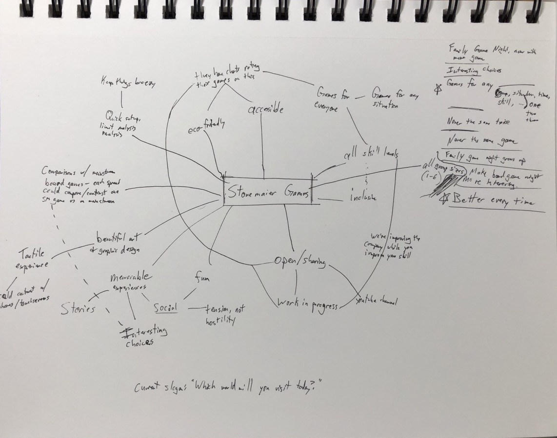
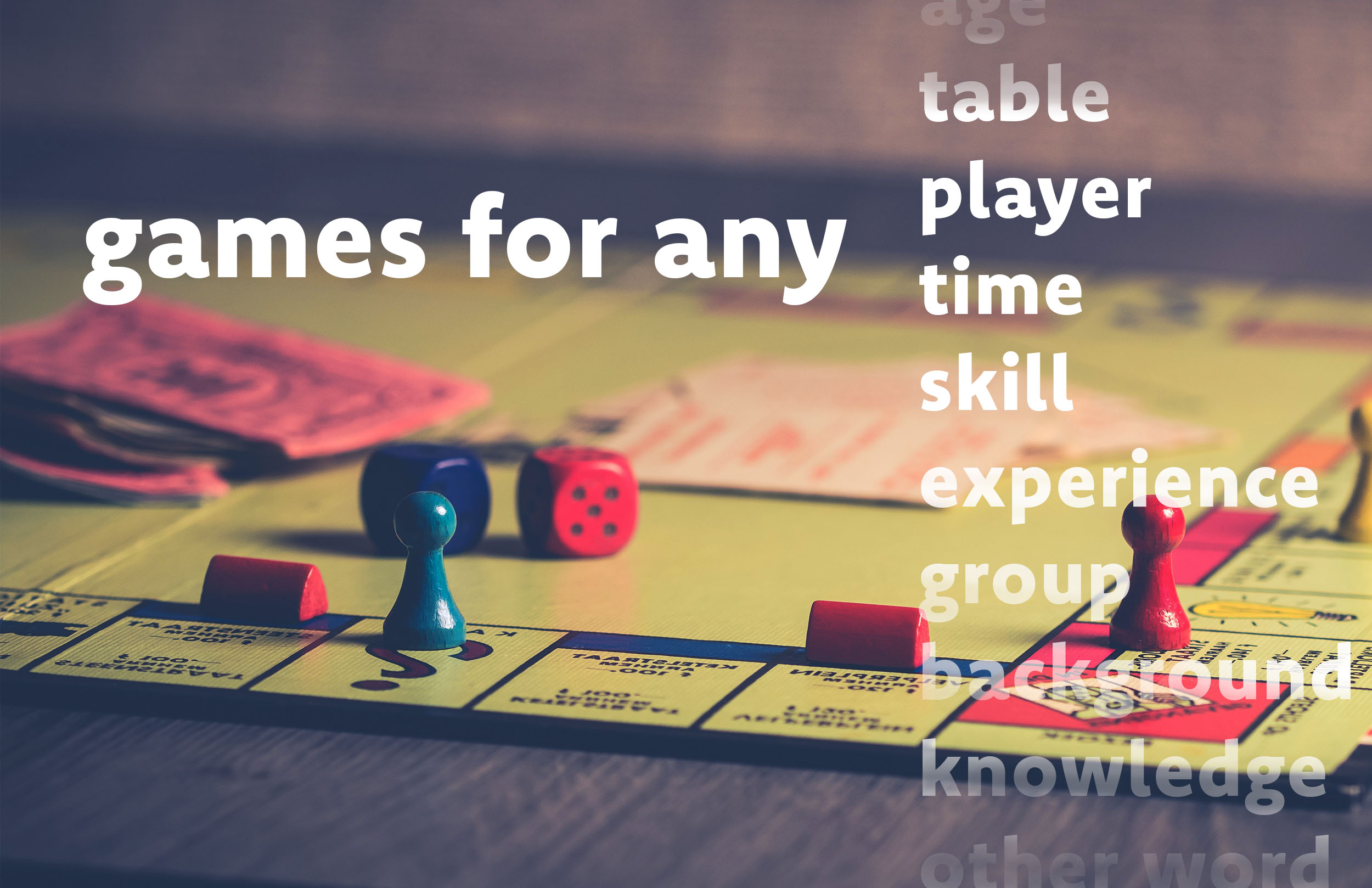
After settling on the concept, I mocked up a quick visual to start to zero in on a coherent style. I wanted to emphasize close-up photography that highlighted the well-crafted components, along with strong type and a sort of scroll/fade effect indicating many possibilities.
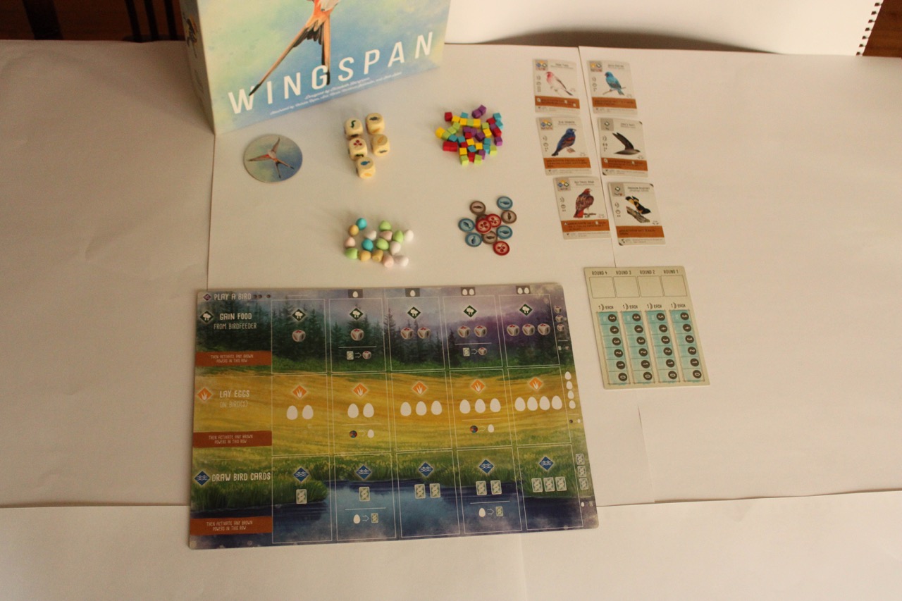
I decided to take my own photos for this project. Without a proper home studio, I had to improvise things like the sweep and lighting. It was a challenge to get things looking good, and I knew I had to get it all in one session because I’d never be able to recreate the exact same setup!
The project involved making a whole booklet for the brand. I highlighted the most successful spread above, but the other ones were a good exercise in trying to apply the concept to a variety of layouts and content.
I also created a small animated web banner that leaned into the “selecting from a scrolling menu” visual.